Investing Account Opening

Company
Questrade Financial Group
Service
Web app design
Industry
Financial
Role
Lead User Experience Designer
Team
2 designers, 1 content
1 Project Manager, 4 agile teams
Year
2024
Completion time
5 mins
(from 23 mins)
Conversion rate
+ 19.7%
Support inquiries
- 39%
My responsibilities
- Led and facilitated collaborative design discovery workshops to align cross-functional teams on business goals and user needs
- Created interactive, high-fidelity prototypes to visualize complex flows and support stakeholder alignment and usability testing
- Conducted unmoderated and moderated usability tests using UserTesting to gather actionable user insights
- Iterate continuously based on usability insights and user feedback.
- Designed and delivered pixel-perfect, accessible UI screens for onboarding and profile management flows
- Contributed and enhanced the design system, ensuring consistency and scalability
- Contributed to accessibility documentation aligned with WCAG 2.1 standards to ensure inclusive and compliant implementation
- Developed comprehensive design specifications, including user journeys, interaction logic, and edge-case coverage
- Partnered closely with engineers during development, offering ongoing design QA, feedback, and implementation support
The project
Rooted in behavioral insights, accessibility best practices, and comprehensive user research, the new experience addressed key friction points, reduced support dependency, and significantly improved clarity and confidence for new users. This strategic redesign not only boosted engagement and shortened account opening times but also reinforced Questrade’s commitment to empowering users in their financial journeys through education and thoughtful design.
The objectives
- Improve Usability: Simplify the flow with user-centric UX principles.
- Personalization: Tailor onboarding to user behaviors and preferences.
- Segmentation: Deliver targeted experiences by grouping users by behavior.
- Engagement: Boost interaction and completion rates with intuitive design.
- Clarity: Provide clear steps and explanations, and add the eligibility criteria upfront.
- Efficiency: Reduce steps to optimize the process.
- Accessibility: Following WCAG 2.1 guidelines ensures accessibility by designing for diverse user needs, making content perceivable, operable, and understandable for all.
- Discoverability: Improve visibility of specific products and account types.
- Error Prevention: Prevent human error by designing proactive solutions, such as clear instructions, contextual feedback, and validation at critical steps.

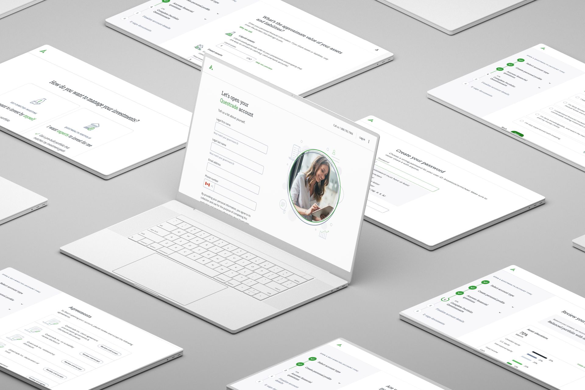
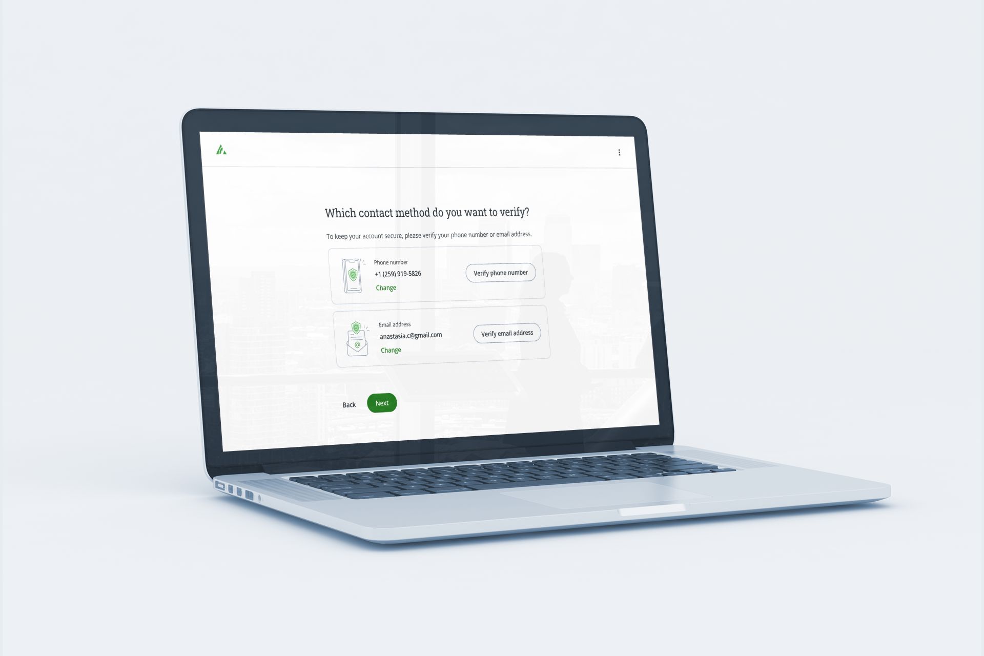
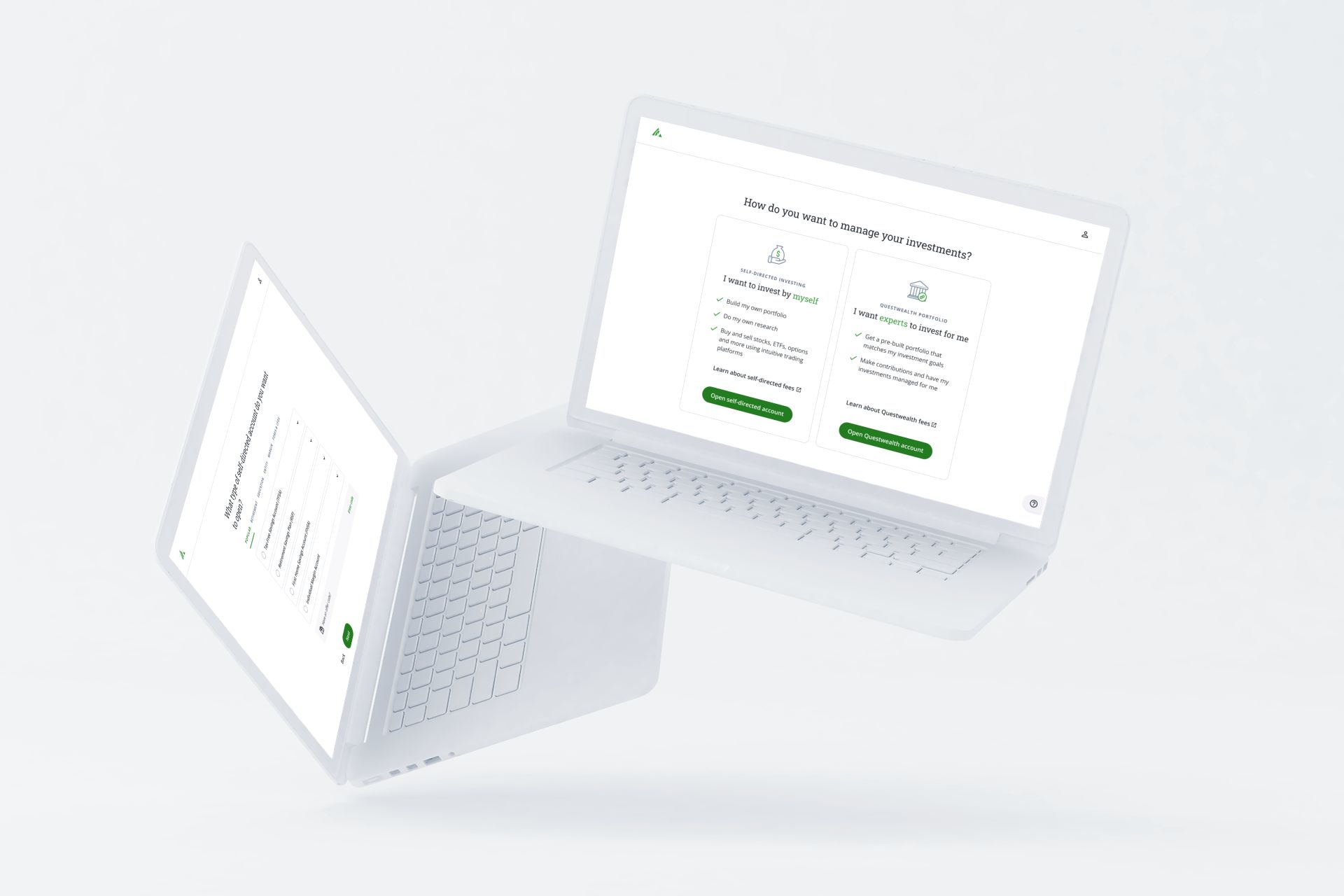
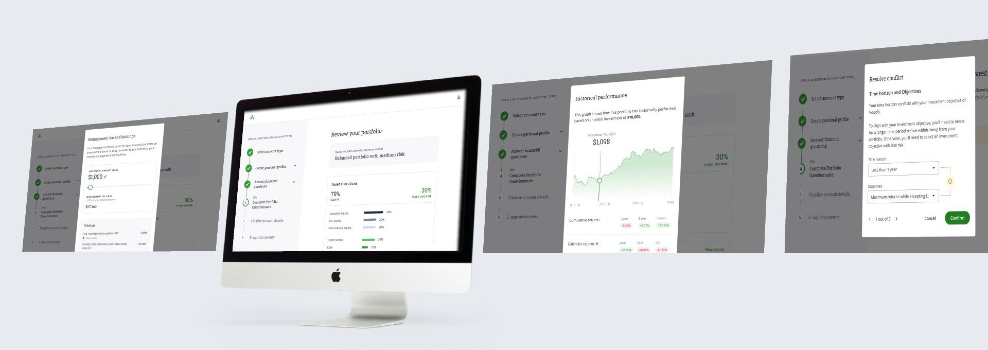
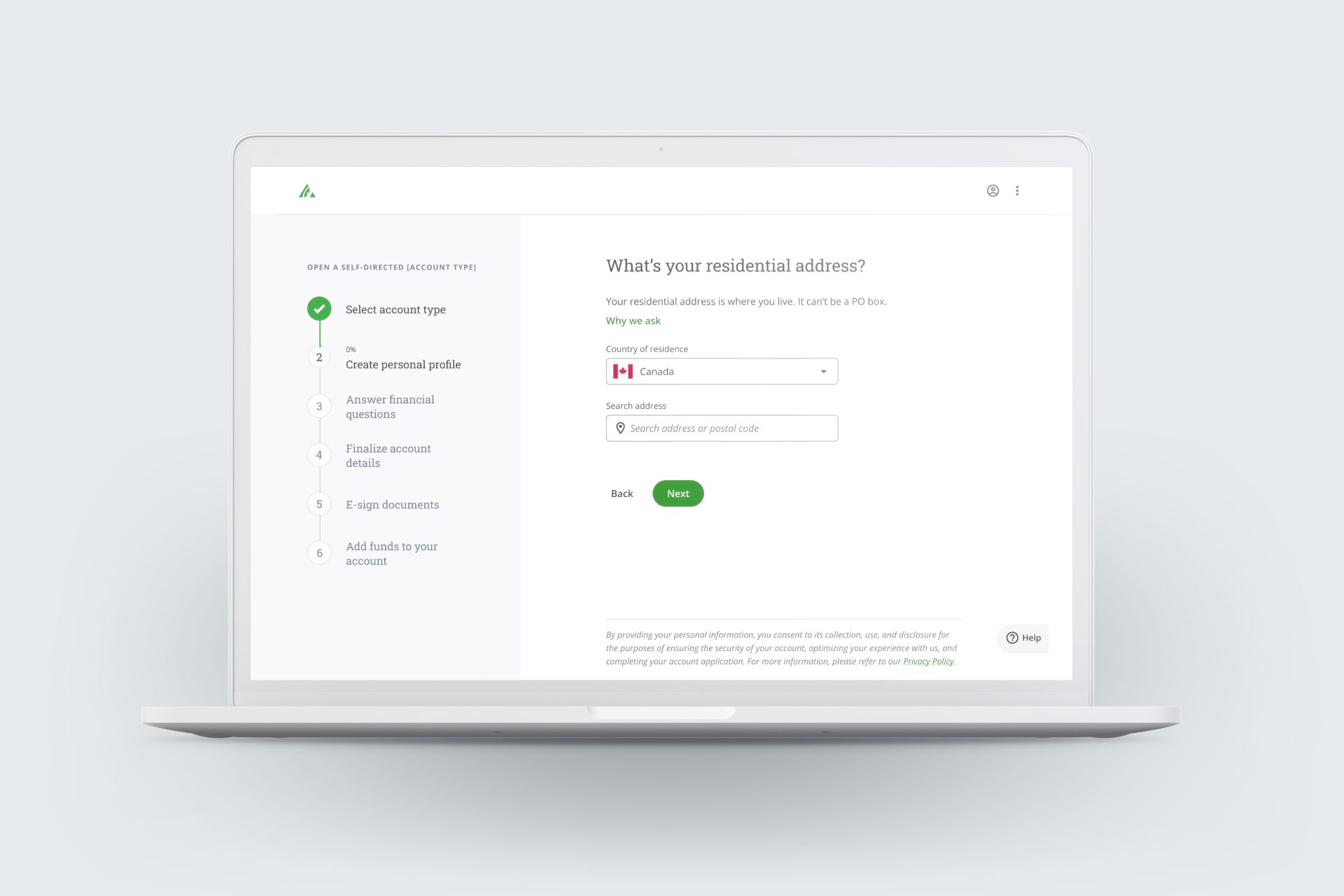
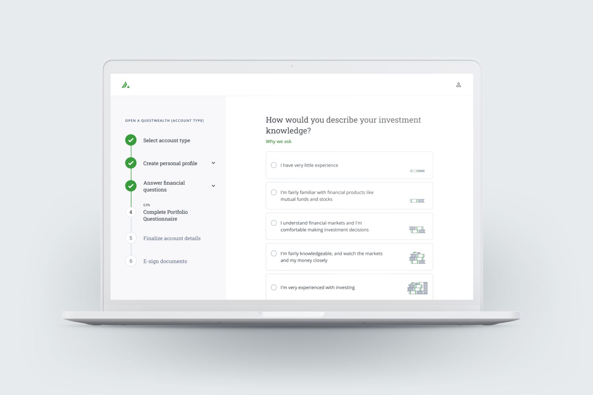
Designing for clarity
To evaluate the effectiveness of the existing onboarding hub versus a guided step-by-step flow, I designed and tested two concepts: the original hub-style experience, where users could choose which profile sections to complete in any order and a new linear flow that guided users through one question at a time using a stepper. Through user interviews and usability testing, it became clear that the hub experience overwhelmed users and led to uncertainty about where to begin or what information was required. Many participants described feeling lost or unsure of their progress, reinforcing the cognitive strain caused by too many options upfront, an example of the "Paradox of Choice" in action. In contrast, users responded positively to the guided flow, noting that it felt more manageable, focused, and easier to navigate. This feedback validated the move toward a streamlined, question-per-screen model that reduces cognitive load and improves task completion confidence.From there, I continued to iterate and test at every step of the process, refining content, flow, and design details, leading to the significantly improved onboarding experience users see today.

Principles & UX laws used

Hick’s law (Simplicity)
Simplified onboarding by reducing options, enhancing clarity, guiding user and minimizing cognitive load.

Miller’s law (Focus)
Break down complex steps into manageable and logical chunks, supporting user-centered design by avoiding information overload.

Law of proximity (Guidance)
Grouping related elements reinforces the principle of guidance, enabling logical navigation.

Goal-gradient effect (Feedback)
Effort and motivation intensify as users feel closer to completing their objectives, using progress visualization to encourage consistent engagement.

Tesler’s law (Ease)
Grouping related elements reinforces the principle of guidance, enabling logical navigation.

Jakob’s law (Familiarity)
Use recognizable patterns to align with consistency and intuitive design principles.
Measuring success
- Engagement Rates: Monitored an increase in completion rates.
- Reduction in Support Needs: Measured decreased inbound calls and chat initiations.
- Conversion Metrics: Analyzed higher account openings post-redesign.
- User Satisfaction: Conducted surveys and usability testing for qualitative feedback.
- Behavior Analytics: Track user interactions and drop-off points.
- Reduced Overall Time: Streamlined workflows to minimize task completion time.
- Minimized Human Error: Implemented design safeguards to prevent common mistakes.