Ancoria Bank sought to revolutionize the account opening process in the European banking industry by introducing a mobile application that allows users to seamlessly open a bank account remotely, without needing to visit a branch. The app aimed to provide a smooth, straightforward experience where users could complete all the necessary steps — from identity verification to document submission — at their convenience. The challenge was to design an intuitive, secure, and flexible user journey that eliminates banking bureaucracy, embraces the latest technology, and maintains the highest security standards.

Opening a bank account has traditionally been a cumbersome process, requiring in-branch visits and extensive paperwork. Ancoria Bank aimed to change this by developing an innovative mobile app that enables users to open an account effortlessly, anytime and anywhere. The app was designed to provide a secure platform for identity verification and document submission while offering unparalleled flexibility. Users could pause the application process, save their progress, and return to complete it at their convenience. Additionally, they could skip certain steps and address them later without disrupting the overall flow. By leveraging advanced technologies like identity verification, document recognition, and eSignature, Ancoria Bank set out to streamline the account opening experience, eliminating unnecessary barriers and delivering a customer-first solution.

Defining user personas
I created personas representing the target users: tech-savvy millennials, busy professionals, and older adults seeking convenience and security. Each person has unique needs, from speed and simplicity to security and reliability.

User journey mapping
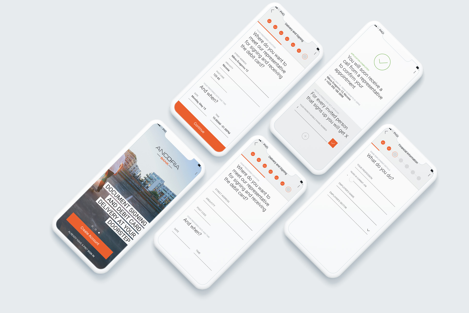
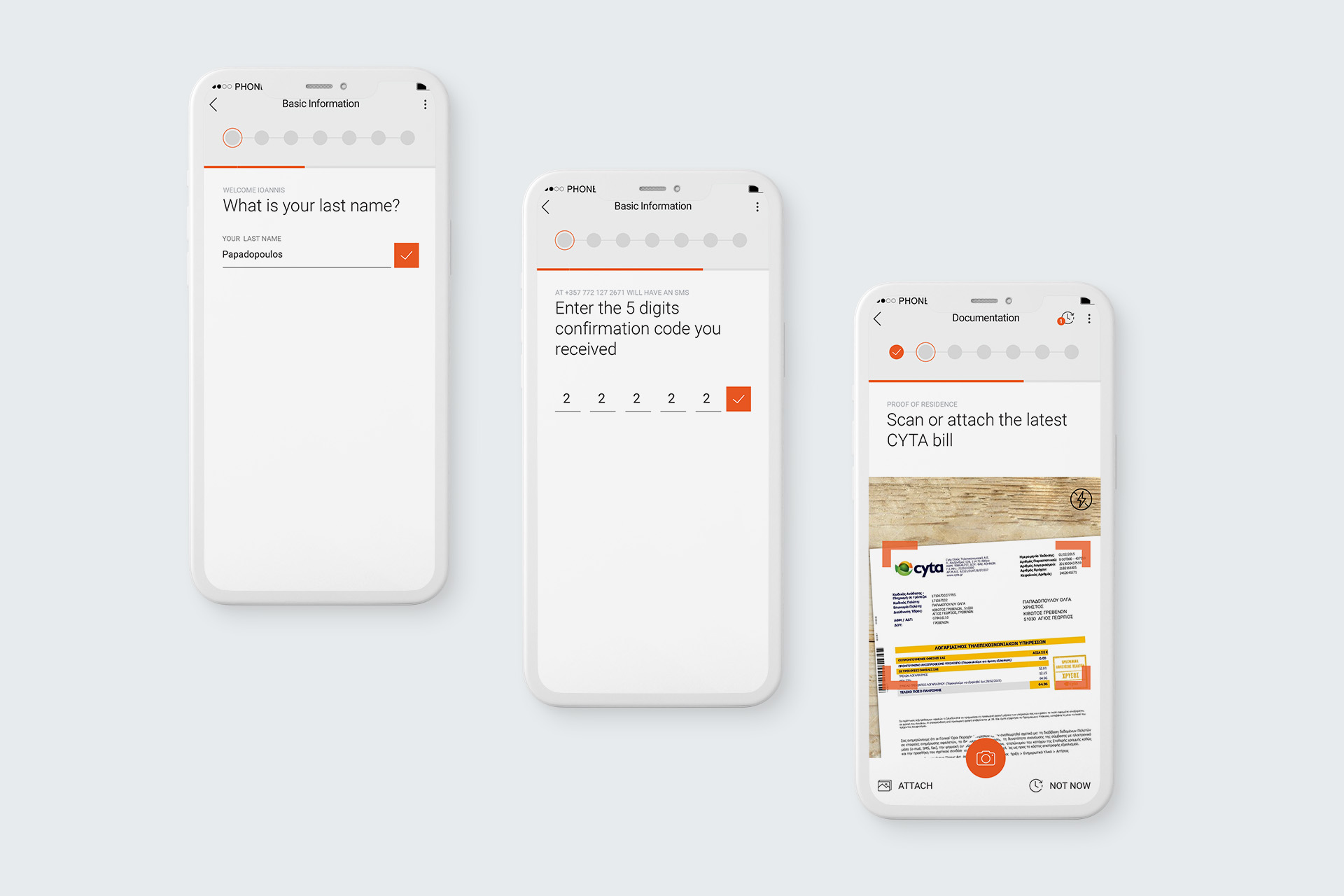
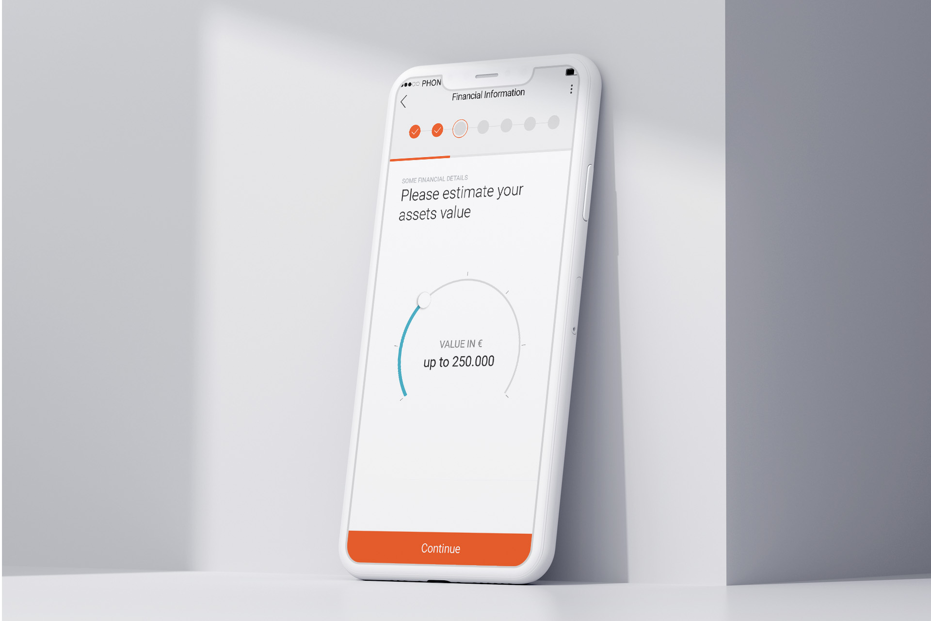
I mapped out the user journey to ensure a seamless flow from login to account approval. Key steps included account creation, where users input basic personal information; identity verification through secure document scanning; digital document upload and eSignature for terms and conditions; and a progress-saving feature, allowing users to pause and resume the process at any time.

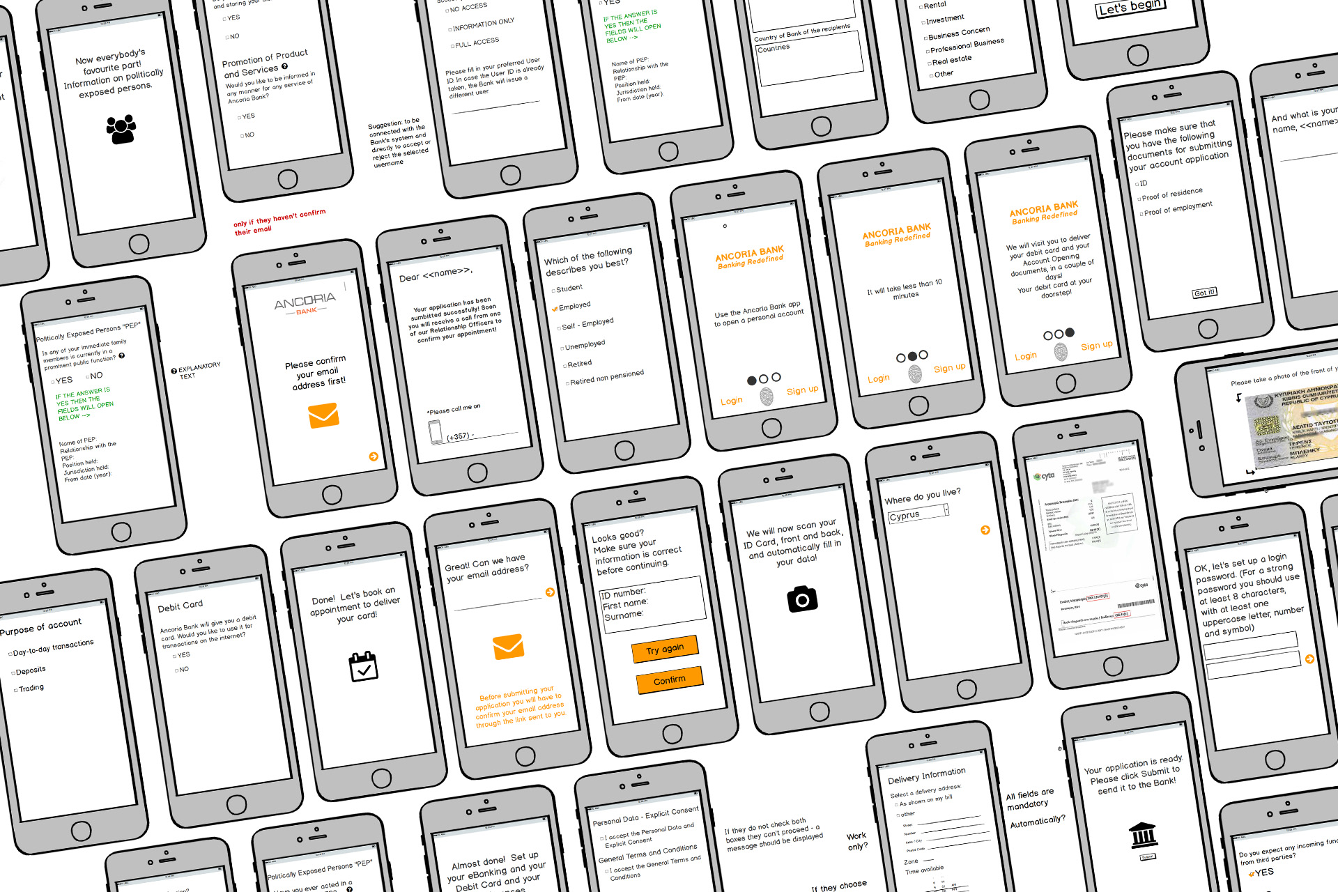
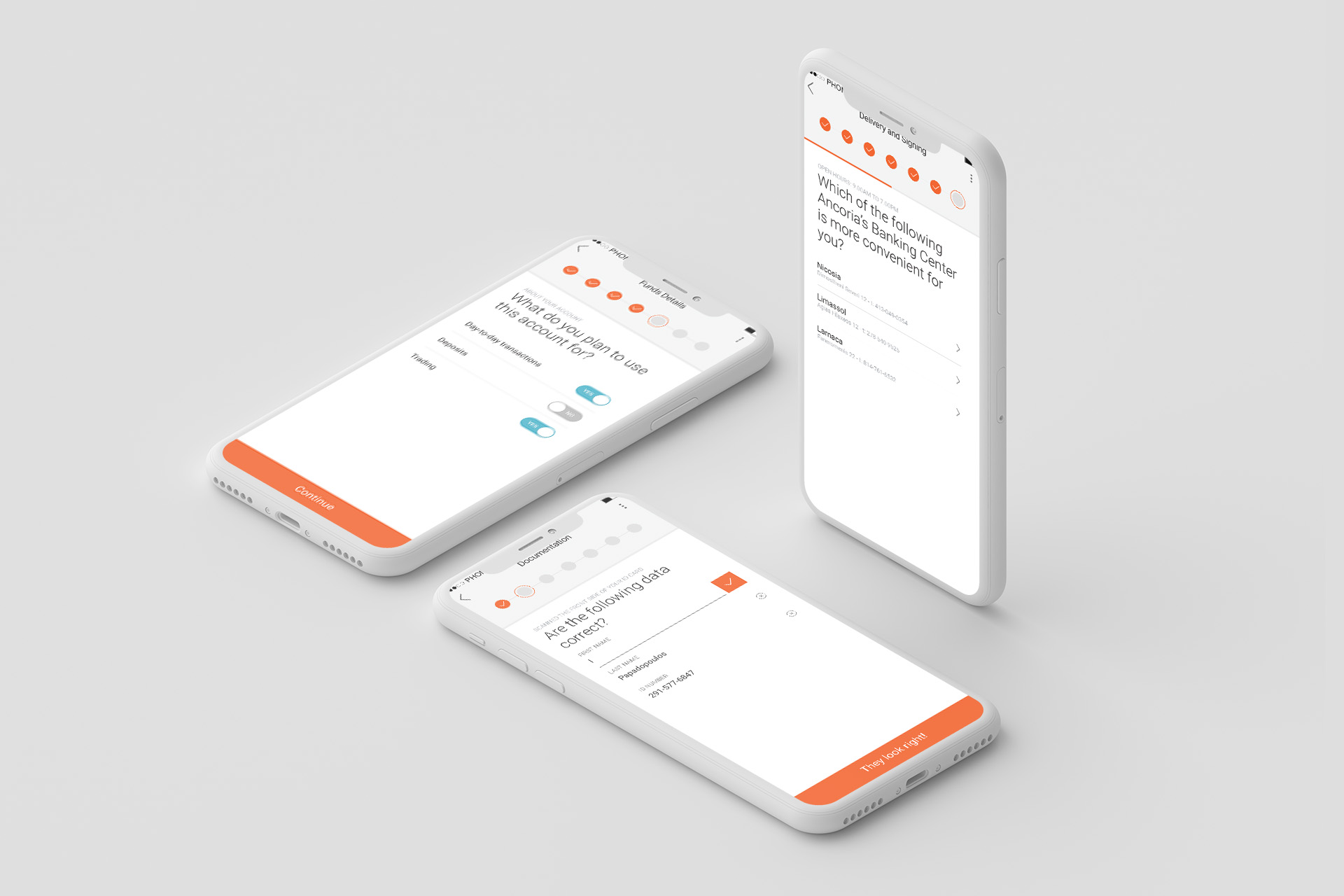
Wireframes & prototypes
I designed interactive low-fidelity wireframes and prototypes emphasizing simplicity, clarity, and compliance. Clear instructions, real-time progress indicators, and secure document scanning ensured a seamless, user-friendly, and secure experience.

User testing
We conducted usability tests with diverse users to ensure the app was intuitive, secure, and flexible. The tests evaluated ease of navigation, the simplicity of identity verification and document submission, and the effectiveness of the “save for later” feature for seamless task resumption.
I concentrated on one action, and one screen should maximize the result. My goal was to keep it simple and focus on one action or one screen. It should be clear where the user has to click to convert, that's why I used a big Call To Action (CTA) button on every screen and clear instructions on every page. The downside is that I have to put more pages on the flow. However, based on the user testing in the early stages of the low-fidelity prototype, it seems the users don't care and prefer the clear one screen - one action layout.

Challenge
Striking the right balance between ensuring robust security and maintaining an easy-to-navigate experience.
Solution
We incorporated digital document recognition for a frictionless process while using encryption and secure authentication methods to protect user data.
Challenge
The process had multiple steps, including document uploads, personal information, and legal signing, which could overwhelm users.
Solution
We implemented progress tracking and clear, concise step-by-step guidance throughout the journey, using the logic of one question per page.
Challenge
Users needed the ability to pause and return to their application without losing data.
Solution
We implemented a session-saving feature that allowed users to pick up exactly where they left off, reducing frustration and making the process more user-friendly.